How to make a pokeball loader


In this tutorial we are going to make a pokeball loader. First we need to set up our mini-project by creating a file index.html and copy the following code into the file.
1<!DOCTYPE html>
2<html lang="en">
3  <head>
4    <meta charset="UTF-8" />
5    <meta http-equiv="X-UA-Compatible" content="IE=edge" />
6    <meta name="viewport" content="width=device-width, initial-scale=1.0" />
7    <title>Pokeball loader</title>
8    <link rel="stylesheet" href="style.css" />
9  </head>
10  <body>
11    <div class="container">
12      <div class="pokeball-wrapper">
13        <div class="pokeball"></div>
14      </div>
15    </div>
16  </body>
17</html>
18
Now we need to create a file style.css with the following code.
1* {
2  padding: 0;
3  margin: 0;
4  box-sizing: border-box;
5}
6
7body {
8  min-height: 100vh;
9  font-family: -apple-system, BlinkMacSystemFont, "Segoe UI", Roboto, Oxygen,
10    Ubuntu, Cantarell, "Open Sans", "Helvetica Neue", sans-serif;
11  width: 100%;
12}
13
14.container {
15  width: 100%;
16  min-height: 100vh;
17  display: flex;
18  justify-content: center;
19  align-items: center;
20  background-color: #d3d3d3;
21}
Basically we are just wrapping our pokeball inside a centered container. Now let's define our pokeball and its wrapper.
1.pokeball-wrapper {
2  width: 150px;
3  height: 150px;
4  position: relative;
5  z-index: 1;
6}
7
8.pokeball {
9  width: 100%;
10  height: 100%;
11  background: linear-gradient(
12    180deg,
13    red 0%,
14    red 47.5%,
15    rgba(0, 0, 0, 0.7) 47.5%,
16    rgba(0, 0, 0, 0.7) 52.5%,
17    white 52.5%,
18    white 100%
19  );
20  border-radius: 50%;
21  border: 2px solid rgba(0, 0, 0, 0.7);
22  position: relative;
23  transform-origin: bottom center;
24  overflow: hidden;
25}
Our pokeball will now look like this
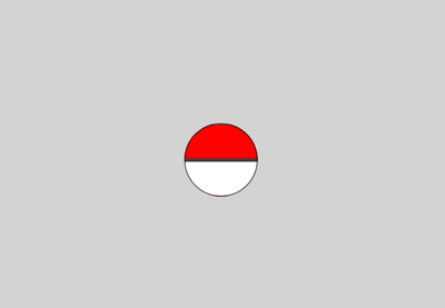
It kinda looks a little bit boring because it lacks details. Let's add a button and shadow to it
1.pokeball::before {
2  content: "";
3  width: 20px;
4  height: 20px;
5  position: absolute;
6  top: 50%;
7  left: 50%;
8  transform: translate(-50%, -50%);
9  background: #fff;
10  border: 1px solid rgba(0, 0, 0, 0.5);
11  border-radius: 50%;
12  box-shadow: 2px 0 0 0 rgba(0, 0, 0, 0.2), 0 0 0 5px rgb(255, 255, 255),
13    0 0 0 10px rgba(0, 0, 0, 0.7);
14  z-index: 1;
15}
16
17.pokeball-wrapper::after {
18  content: "";
19  width: 90px;
20  height: 10px;
21  position: absolute;
22  left: 30px;
23  bottom: -5px;
24  background-color: rgb(50, 10, 10);
25  border-radius: 50%;
26  z-index: -1;
27}
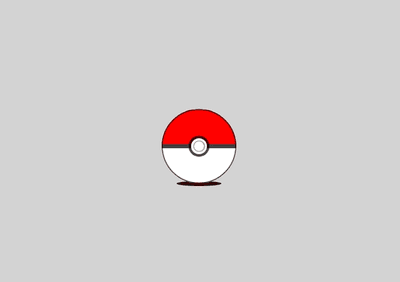
Now it looks better! Let's add some animations as well.
1.pokeball-wrapper::after {
2  ...
3  animation: movingShadow 2s ease-in-out infinite;
4}
5
6.pokeball {
7  ...
8  animation: bounce 2s ease-in-out infinite;
9}
10
11@keyframes bounce {
12  10% {
13    transform: translateY(-35px);
14  }
15  15% {
16    transform: translateY(0px);
17  }
18  25% {
19    transform: translateY(-15px);
20  }
21  30% {
22    transform: translateY(0px);
23  }
24  50% {
25    transform: rotateZ(10deg);
26  }
27  60% {
28    transform: rotateZ(-10deg);
29  }
30  70% {
31    transform: rotateZ(10deg);
32  }
33  100% {
34    transform: rotateZ(0deg);
35  }
36}
37
38@keyframes movingShadow {
39  10% {
40    transform: scaleX(0.6);
41  }
42  15% {
43    transform: scaleX(1);
44  }
45  25% {
46    transform: scaleX(0.8);
47  }
48  30% {
49    transform: scaleX(1);
50  }
51  50% {
52    transform: translateX(6px);
53  }
54  60% {
55    transform: translateX(-6px);
56  }
57  70% {
58    transform: translateX(6px);
59  }
60  100% {
61    transform: translateX(-6x);
62  }
63}
64
Hmm, our pokeball looks good but it is missing something. It is missing some shining effects on the pokeball. So let's add that.
1.pokeball::after {
2  content: "";
3  width: 150px;
4  height: 150px;
5  position: absolute;
6  top: -45px;
7  left: -35px;
8  border-radius: 50%;
9  background: radial-gradient(
10    circle at center,
11    rgba(255, 255, 255, 0.8),
12    rgba(255, 255, 255, 0) 50%
13  );
14  transform: skew(-10deg, -10deg);
15}
Tadaa 🎉! That's it! Our pokeball loader is now finished. Thanks for following this tutorial. Any feedback are welcome and appreciated!
Back to blog